The emergence of writing was one of the most significant events in the history of mankind. Writing has enabled development and progress for more advanced civilizations and has made it possible to transfer valuable experience and knowledge across generations. At first it brought information, but over time it began to be used to entertain people as well. However, we do not want to deal with its content, but rather we would like to focus on the different types of fonts. In this article, we will outline the rules for using fonts in the printing industry so that they can properly serve their function.
Font Families
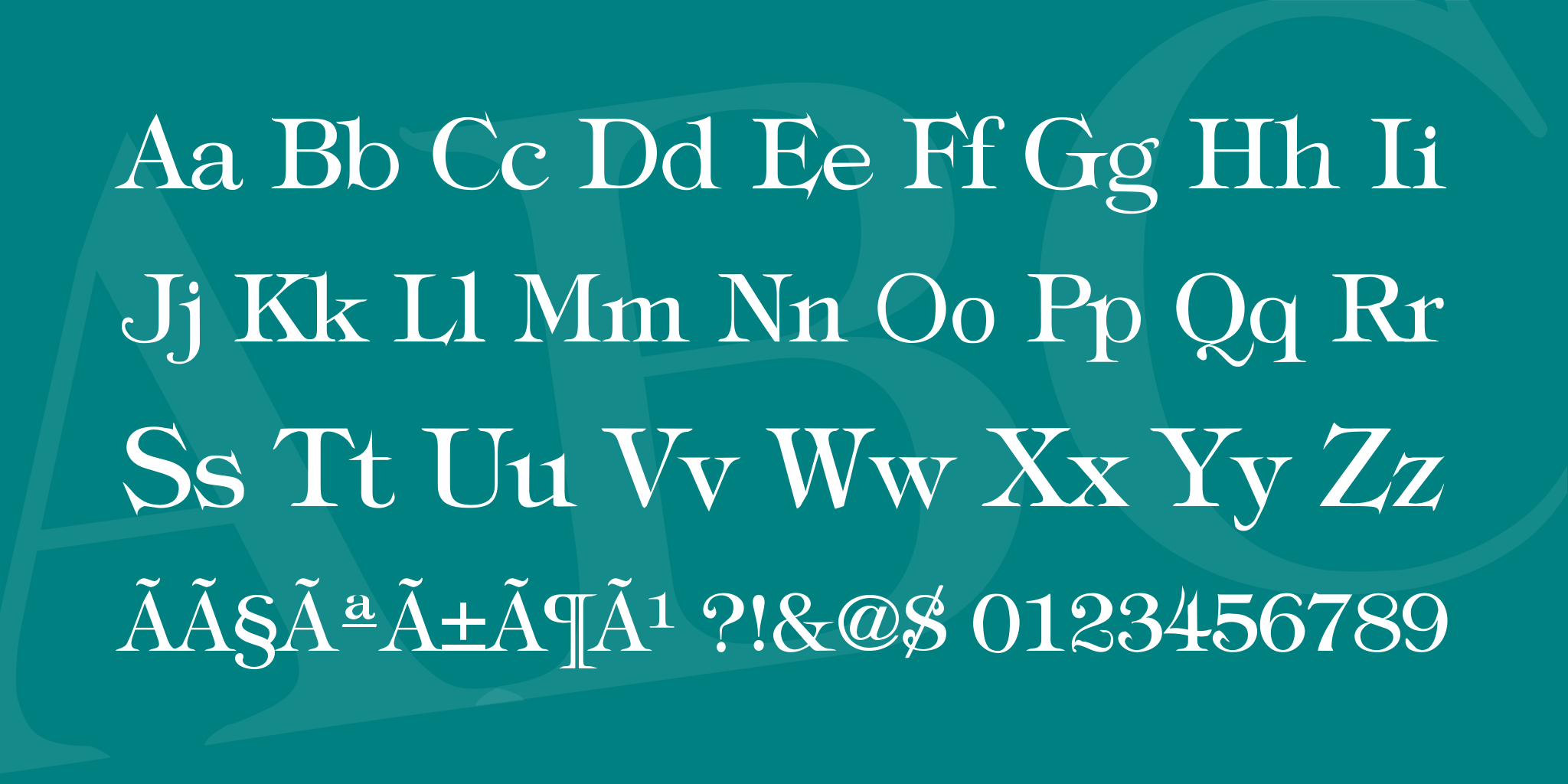
Let's start by breaking down the types of fonts in printing and include a little typographic vocabulary. A font is actually a complete set of characters, letters, numbers, and symbols that share a common thickness, width, and style. Each font has its own set or family with which it shares a common appearance.
Fonts
Graphic designers, when creating designs, must think about what type of font they to use. There is a wide variety of fonts, but they may be divided into two basic groups: serif and sans serif. The most suitable fonts for printing are sans serif fonts such as Arial or Calibri, though decorative or calligraphic fonts are not necessarily a problem. However, it is important to always keep the correct font size and consider the color scheme so that the text can be easily read.
Label design a.s.
Sans serif font Arial
Label design a.s.
Serif font Times New Roman
Font size
Font size plays a crucial role in the readability of texts. The rules for print fonts are different from those for electronic fonts. The size of the letters is given in typographic points or by the abbreviation pt (petit).
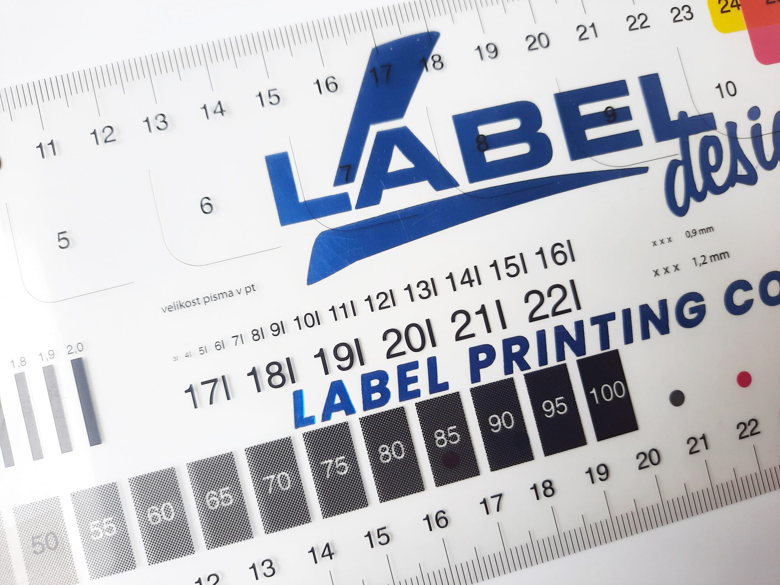
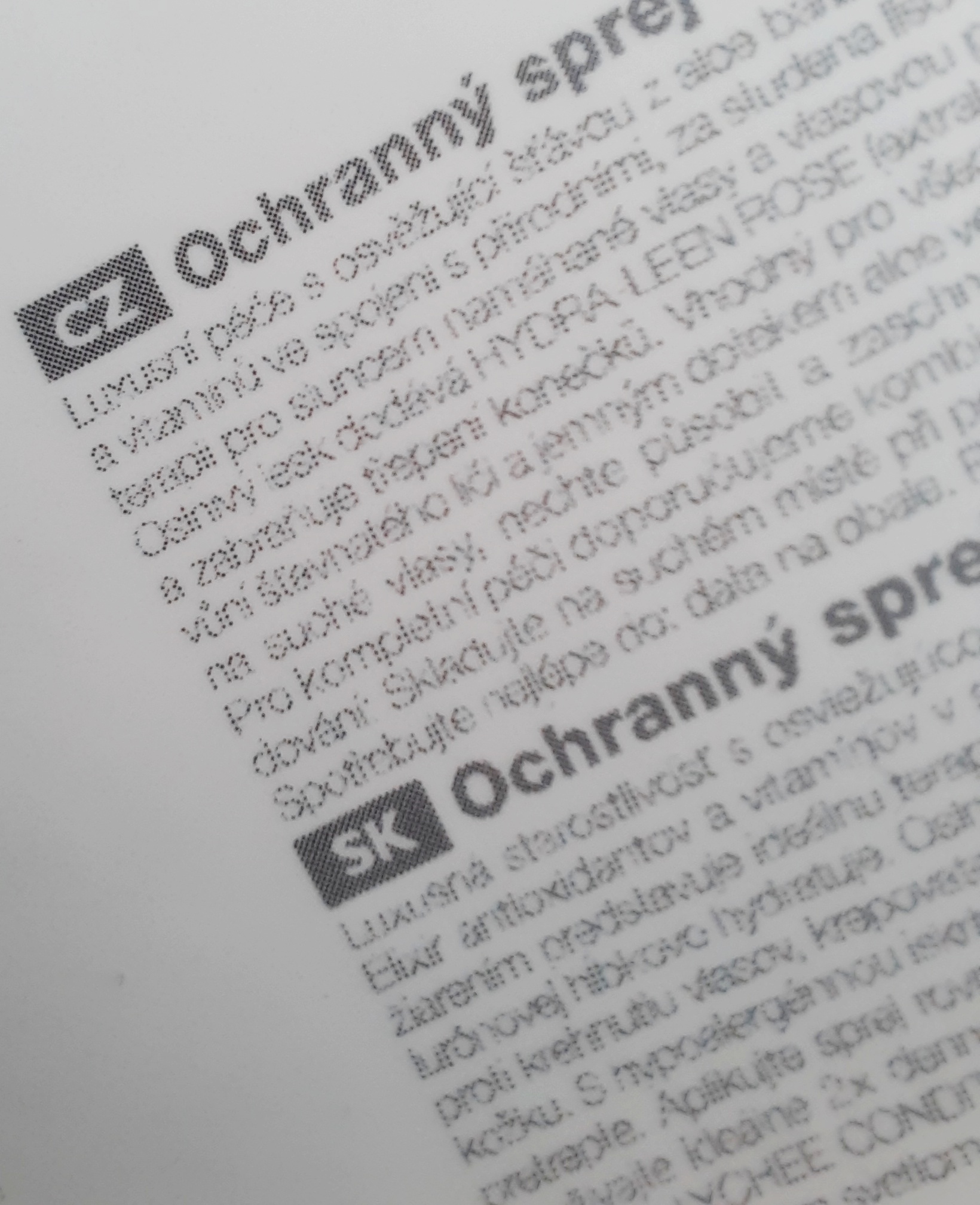
In general, a font is legible from 5 pts, but it depends on the color used and whether the text is positive or negative. In negative texts, the text should have as much contrast to the colored background as possible. Rasterization is also an important factor. If the text is not fully opaque, the raster (bitmap image) may significantly reduce readability.
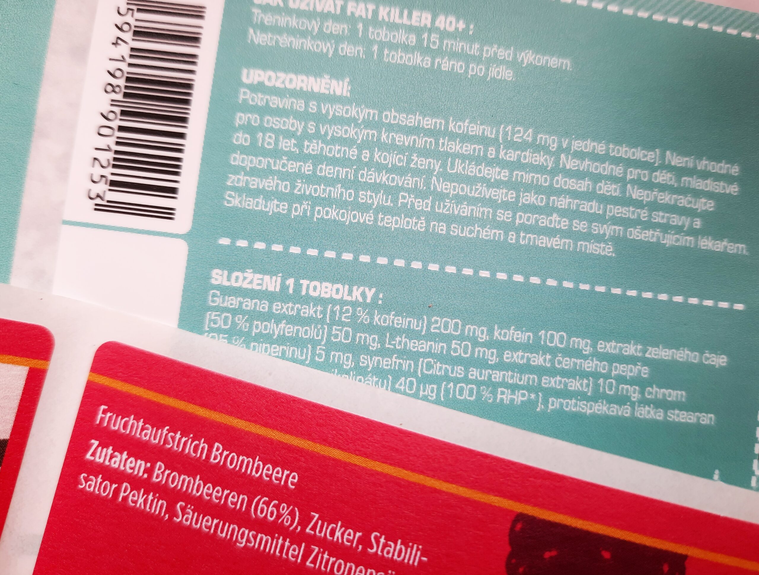
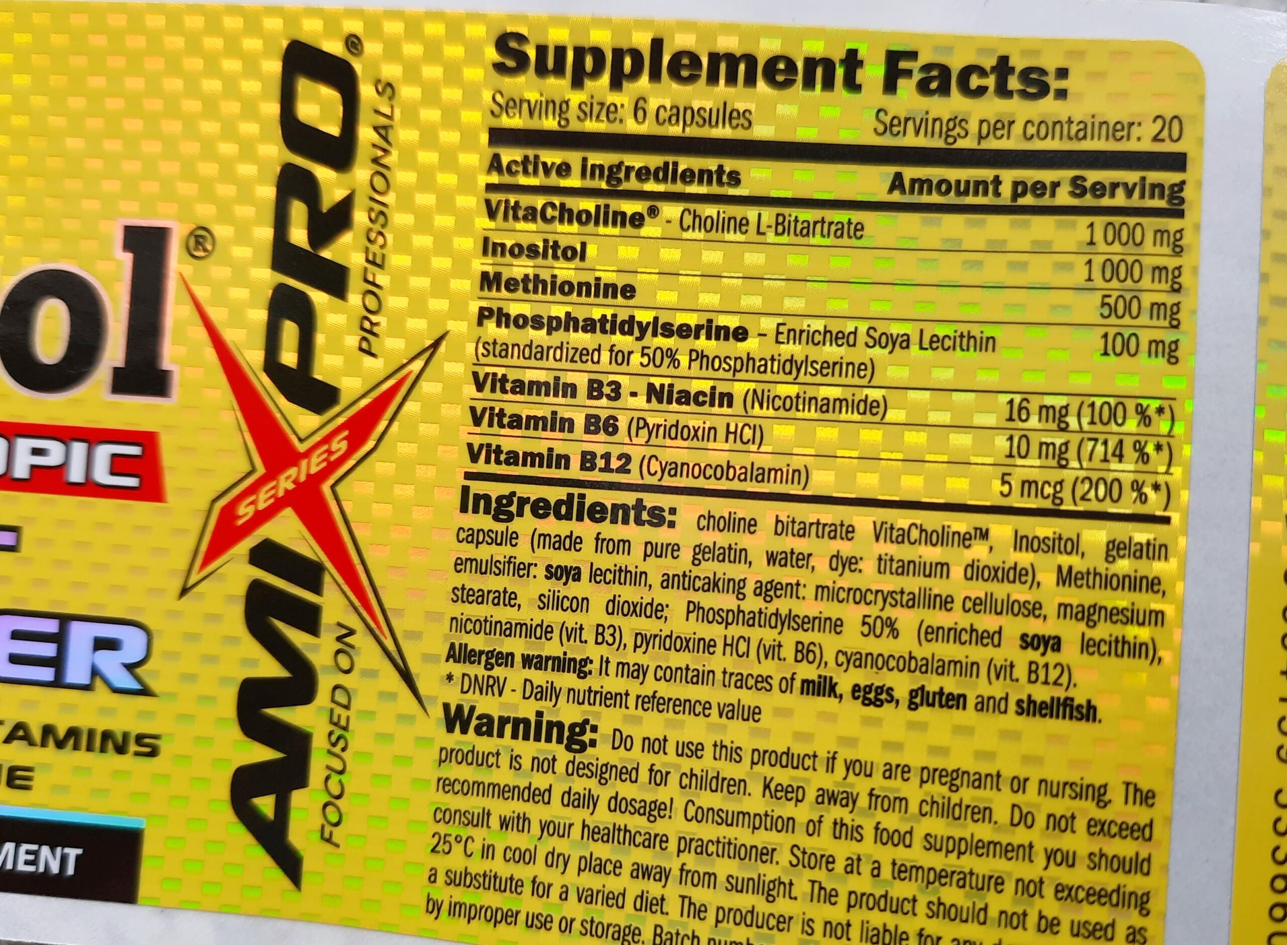
In the food industry, there are mandatory regulations for font size. The height of the lowercase letter ‘x’ must not be less than 1.2 mm.
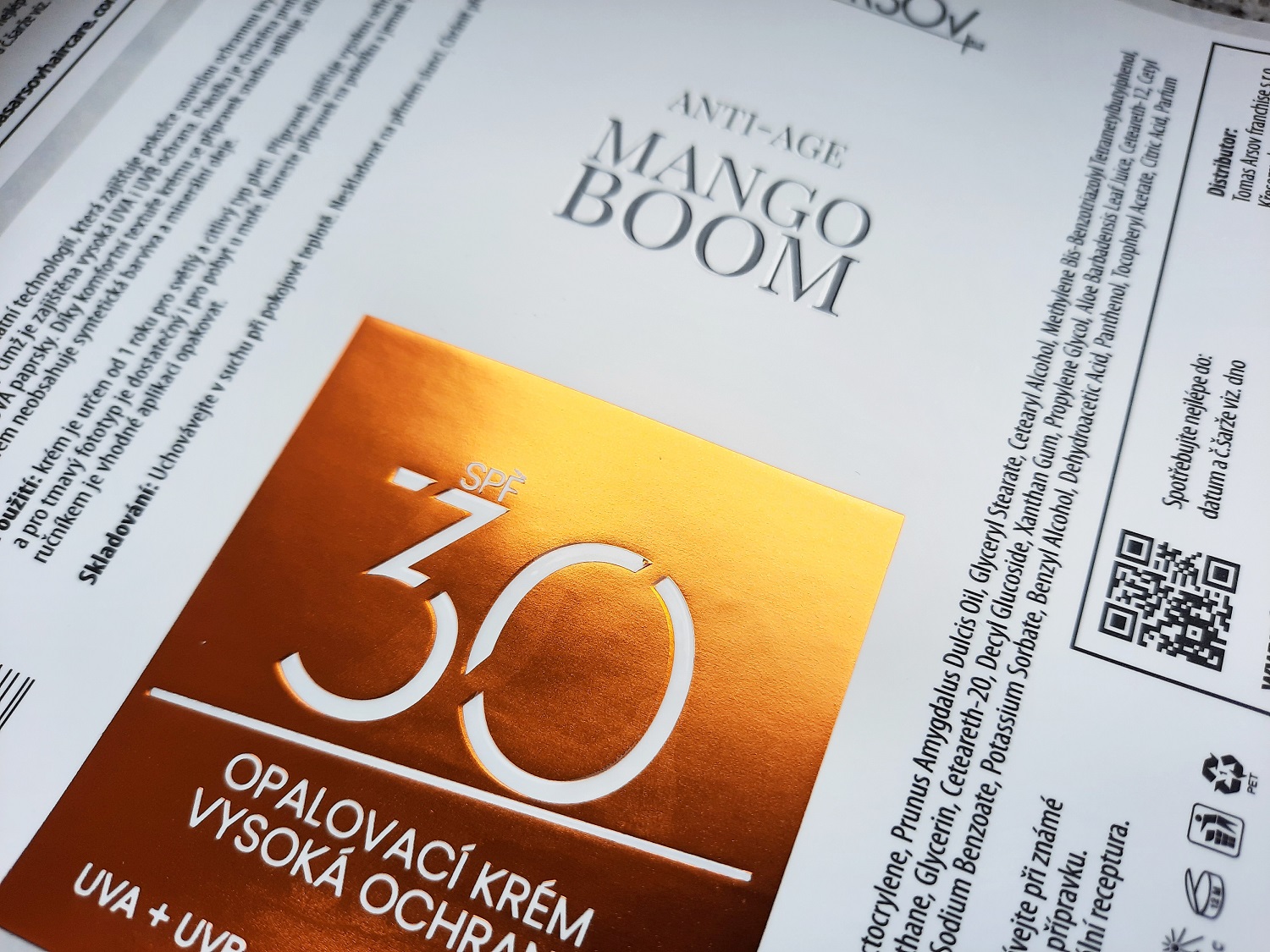
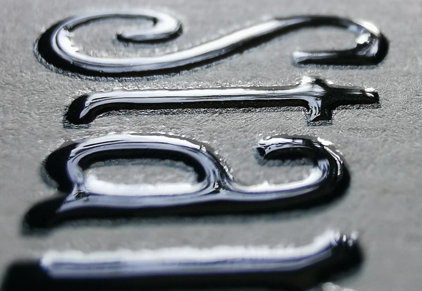
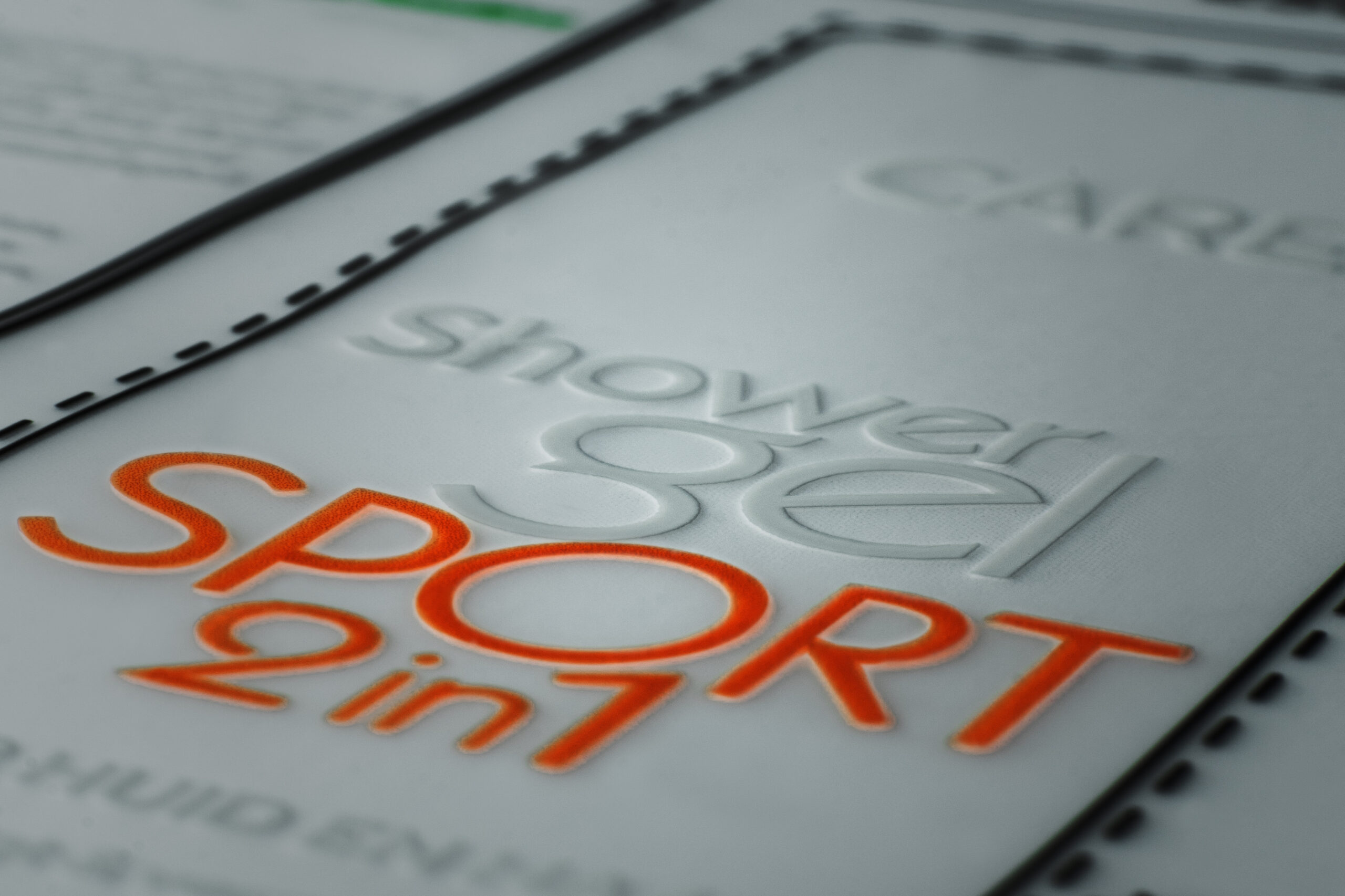
If you want the text not only to convey information, but also to serve as a design element, we recommend refining the letters in various ways.
